
Since Tim Berners-Lee, the inventor of the World Wide Web and HTML, created the first webpage back in 1990 while working at CERN, the Internet has evolved into a vast landscape consisting of a multitude of things like online storefronts, chat forums, information pages and… ahem… other less-than-savoury websites…
The simple webpage has arguably gone through more innovations in the last twenty years alone than almost anything else. Gone are the days where you had to build websites as one giant spreadsheet-like table, and learning how to create them involved many hours of reading “idiots guides” and large tomes dedicated to how HTML should be written. Even the resources that ended up becoming the norm have come and gone – any developers out there will surely remember StackOverflow, the place to go to get a solution to a niche coding problem while also being told you’re an idiot for not using this-or-that instead.
One thing that hasn’t changed as much however is the basic terminology used in regards to how a website is made or how it looks. Sure, there are new toys that come along and add to the list, but the main bulk of them are the same as they have been since the 90s. Here is a run-down of most of the basic terms:
Architecture
Frontend and Backend development
In short, the difference between Frontend and Backend development is that Frontend is what you should see on a webpage and Backend is what you shouldn’t see. Frontend developers deal with how the website looks and how the users interact with the website, whereas Backend developers focus on the magic behind-the-scenes like databases, order processing and anything that keeps the website running.
In more recent years, the lines have blurred so that there is more crossover between the two, but that’s detail for another time. Also worth noting – if someone describes as a “Full Stack Developer”, it means that they do both Frontend and Backend development themselves.
Header
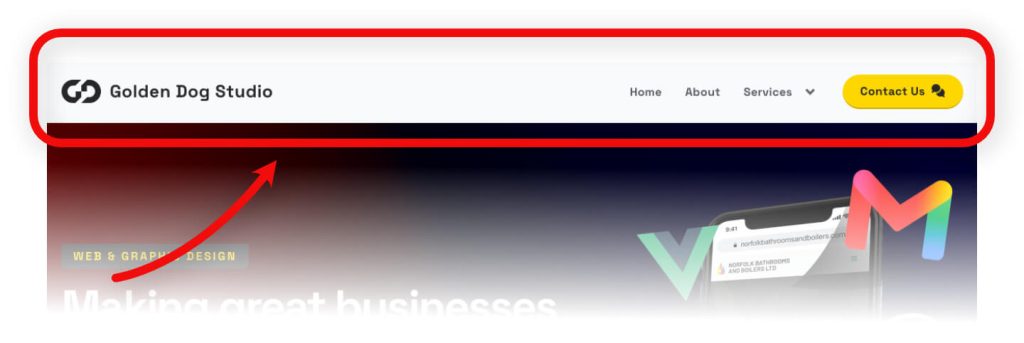
The header of a webpage is the part that sits at the top, and is usually consistent between all pages on a website. It’ll usually hold the navigation menu and a logo, and can be described as a “fixed” or “sticky” header if it stays on the top of the page as you scroll up and down the page.
Footer
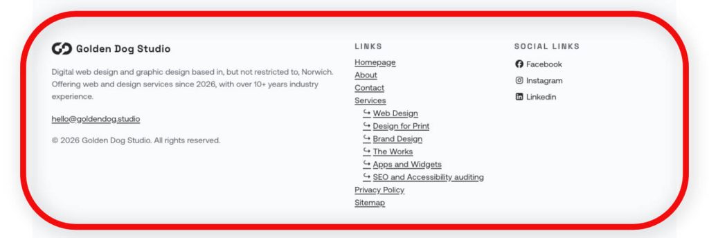
The footer of a webpage is basically the opposite to the header – it sits at the bottom of the page and is usually the last element that you see as you scroll down the page. A good footer will include things like links to important pages, a copyright disclaimer and possibly links to social media.
Navigation menu
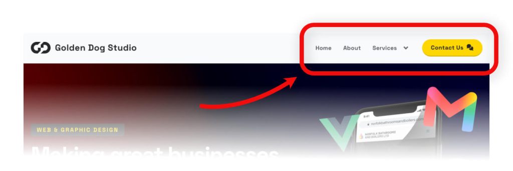
The navigation menu is usually the primary way for users to navigate around your website, including links to important areas you want to funnel users towards. A good “nav” is clear, accessible and has minimal visual fluff around it that can distract a user and make it difficult to follow.
There is a variant of a navigation menu known as a “mega menu” that consists of many sections and links within it. This is usually used on large websites like Amazon, Ikea and any other big retailer. They present a challenge where the sheer amount of things can confuse a user, but if done correctly it can allow users to get to particular sections of the site easier (e.g. a link to “Sofas” could sit in a “Living room seating” section, which could sit within a submenu for “Products”).
Hamburger menu
No, this isn’t the thing you have a look at a Five Guys restaurant (well, not in this instance anyway…). It is a menu that is usually shown after you click on a button, and it is normally the preferred way of showing a navigation menu on mobile and smaller tablet devices, as it cuts down on the amount of links that need to fit inside the header on smaller screens.
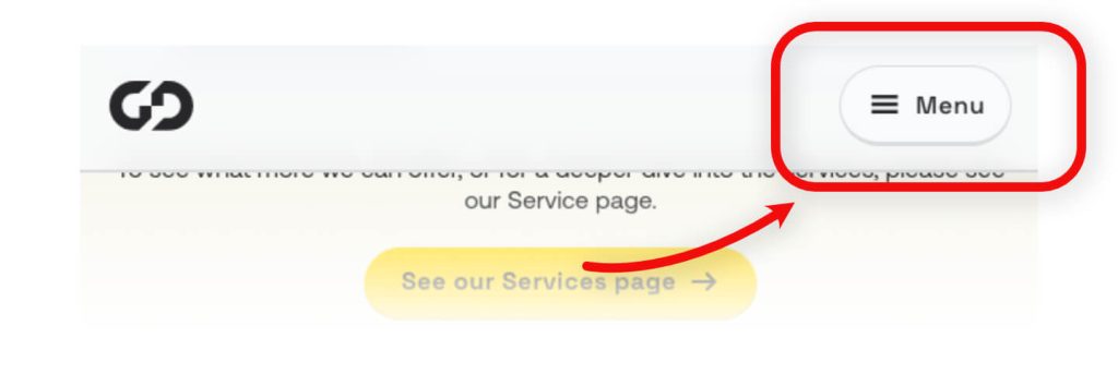
A hamburger menu gets it’s name from the icon that is regularly used to open it – three parallel lines stacked on each other (similar to how a hamburger is stacked). Once a user clicks on the hamburger button, a menu will get shown to the user with a navigation menu within it. It can be different to the usual desktop navigation menu, but follows the same rules about clarity and brevity where possible.
Web Hosting
Web hosting refers to the server space that a website lives on. Think of it as “the home of a website”, where all the necessary files live to be served to a user that visits a particular web address.
Every website requires a host of some kind, whether it is through a mainstream hosting provider (like Hostinger, GoDaddy or Ionos), through a smaller hosting provider or through a homemade server. Shameless plug – Golden Dog Studio offers web hosting as a service, or we can help you get set up on a provider. Get in touch if that’s something you want to know more about!
Anatomy of a page
“Above the fold”
The term “above the fold” initially came from newspapers – papers on the newstands were stacked folded in half, so the editors had to put the most eye-catching pictures and headings on that top half to stand out as much as possible. For webpages, it’s a similar deal, where a user only initially sees the very top of a webpage until they have to scroll, so getting your main point out there in that small section is important.
Most website visitors decide within a couple of seconds if they want to continue on a website or leave, so maximising the impact of that top-section is a big deal for retention.
Hero section
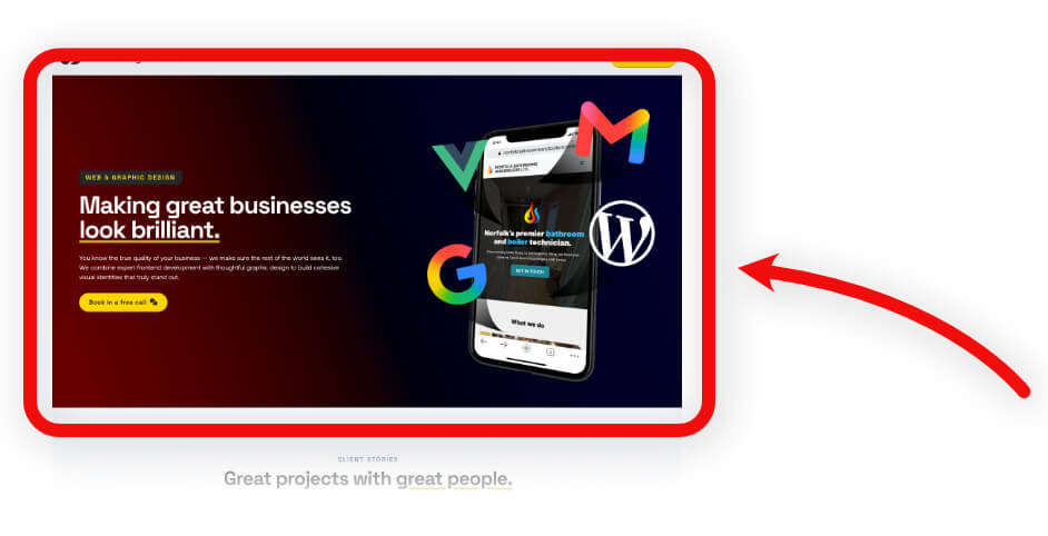
The hero section is the first visual area of a webpage. It is usually a banner or a carousel that acts as the main driver of information as to what a page or service is about. A good hero section consists of a clear message, an appealing look that gets users to actually read it, and importantly has some form of call-to-action like “Sign up” or “Shop now”.
Body content
The body content of a page is the main meat of the page itself, where the bulk of the text, images and any other information lives. A webpage without any meaningful body content is a wasted opportunity, and can even harm how your website performs on search engines. It is also important to not fluff-up the content with text just for the sake of padding it out – this can have the same detrimental effect.
Simple, focused content is king here – describe what your service does and how it can help users. Show what your online store has on offer that can change their lives. Talk about a bunch of web terminology, in the slim hope that someone reads it and would like to work with you (sorry, it had been a little while since the last shameless plug – please get in touch!).
Sidebar
A sidebar is a narrow column that usually gets placed on the left or right of body content, consisting of ‘extra’ content and links that may be appropriate to share but isn’t the main piece of the page. It’s normally used on blog pages for recent posts and latest posts, but can be used anywhere.
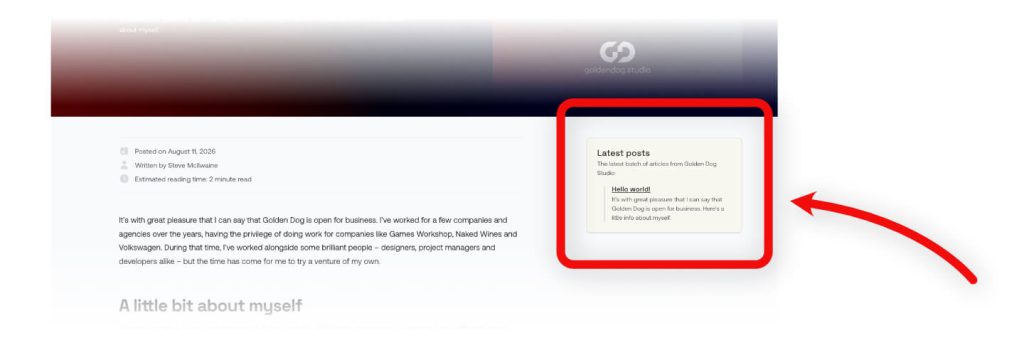
Sometimes a sidebar is used as part of a “dashboard app” to hold navigation links to sections of the app. Usually it would still be considered as a navigation menu rather than a sidebar, but really the “sidebar” term is used for the layout purpose rather than for the functional purpose.
“Whitespace” (negative space)
An amateur designer’s worst nightmare – emptiness. Using whitespace is every part as important as using visuals. It allows a page to feel less cluttered, and the added breathing-room helps to make something seem more luxurious – why shout about a product when the product can just do the talking itself?
A user can follow a webpage more easily when they haven’t got a thousand images and headlines screaming at them at once. Don’t be afraid to leave a little bit of space.
Page elements
User Interface (UI) and User Experience (UX)
UI and UX are usually thrown around as terms together, but there is a difference between them. A lot of designers will say they can do both, but some are more specialised in one side or the other depending on the background they have come from. For example, a frontend developer may be a better UI designer as they work extensively with a lot of the page elements on a daily basis, but a QA tester will likely approach things from more of a grander UX standpoint as they test user journeys often.
UI is about the specific visual elements in a page that a user interacts with, like buttons, typography, colours and animations. It’s important as visual feedback can be the difference between a user staying or leaving out of frustration.
Picture this scenario – you’re on a website, and you press a button to confirm payment for something. Nothing obvious is happening on the screen. Do you assume that something is happening in the background? Do you go to press the button again? Do you think something has gone wrong in the process? All are valid thoughts and actions, but if it is just a slow process wouldn’t you feel more confident that some thing is happening if the button showed a loading icon, or displayed a message saying “please wait”? These are the issues that UI designers look to solve.
UX is all about the grander experience of a user journey. If UI is about the small details, UX is about the sum of all those details. Good UX means that a user does what they need to simply and quickly with minimal fuss. UX design is the removal of obstacles and painpoints from a user’s experience.
As an example, let’s say you want to buy an outdoor table on a website. How infuriating would it be if you had to click “products” in a navigation menu, to then have to click on a “furniture” button in a search panel, to then have to refine it further to “tables”, which then shows hundreds of indoor tables with the only outdoor table being a random result in the middle? Worse still, what if the outdoor tables aren’t actually listed as a “table”, but are in a separate “gardening” section under “outdoor storage”? These are needless roadblocks, and are easy to fix with basic UX practices.
Call-to-action (CTAs)
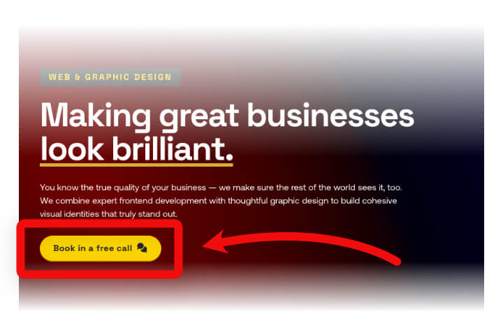
In simple terms, a CTA is a prompt to tell the user what to do next. They’re usually in the form of a button that will instruct a user to “Get a quote”, “Buy now” or “Contact us”, but are basically any action to follow up on something. They are a handy tool to make it clear what the ideal flow is both for the user and for a company. A good CTA usually stands out from the page in a bold colour, drawing the eye in as much as possible.
Internal links
Internal links are links that allow the user to go to a relevant other page on your website. Oh wow, here’s one now! Get in contact with us!
They are crucial for keeping users engaged around your website, and they can improve your SEO score (although more recently it doesn’t have as big an impact as it did years ago).
Carousels (or sliders)
Carousels are interactive elements on a webpage that show a rotating slideshow of images or content blocks. Used correctly, they allow you to display more things in a smaller space, but with that comes many other issues.
Firstly they are an accessibility nightmare. Many are set up in a way that makes screen-readers hard to follow and tabbing through them makes accessible navigation a minefield. On top of that, if you have interactive elements within the carousel, you get a whole host of issues around tabbing orders and how it gets picked up in browsers.
Secondly, they add bloat. My personal opinion on them is that they are an excuse to cram more into a page when you can’t afford to cram more things in. The javascript code used for them adds extra loading time to your pages, which slows them down, and if any of it goes wrong for any reason it leaves your page looking broken. Use them with caution, but first ask if they are being used for a good reason!
Forms
There’s no trickery going on here, Forms are as you would expect – a defined set of data-entry fields that a user fills out, which are submitted to have something done with that information, be it a contact form or signing up for an account on a website. There are accessibility considerations with them (as with anything), but they are handy for getting information and all browsers have been used to them for many years so they are well adopted and easy to use.
Hover and Focus state
Both of these states have been around for many years, but have long been neglected as “nice to have” considerations, and have been used a lot for gimmicky purposes (e.g. animations). More recently though, with Accessibility laws that have been introduced, they have become an important part of a design.
Hover state refers to when a user hovers over an element with a mouse or trackpad. When the cursor is over the element, you can use some design tricks to make it obvious it is interactable, like a subtle background change or a little wiggle animation.
The focus state shows which part of a webpage you are currently interacting with. It works like a temporary highlighter, moving between clickable items like buttons, links, and text fields. You can move from one item to the next by clicking them or pressing the Tab key. To make the active item easy to spot, browsers usually wrap it in an obvious outline.
Brand and backend basics
Database
A database is a stored collection of data. Think of it as a digital filing cabinet behind a website that can hold dynamic data like customer accounts, blog posts and order histories. You can have multiple databases for a website, and the tables can be linked together with a common key pairing (e.g. a Customer ID can be used to track customer details as well as linking that customer to an order history).
Favicon
The favicon is the tiny icon, usually a logo, that appears in the browser tab next to the page title. They help to differentiate your page’s tab in the browser from others.

Typography
Typography refers to the style, arrangement and appearance of text on a website. It covers the different heading sizes (i.e h1, h2, h3) that are used on a webpage, as well as the body text that is used for general reading in the body content.
Content Management System (CMS)
A CMS is software that can be used by non-developers to update and customise a website. Some allow full control where you can change anything in a website, and some are more locked down so that you can only edit things that won’t break the styling of a website. There are many CMS examples out there, with WordPress being the most popular on the internet (powering over 40% of websites). Shameless plug – if you want a WordPress site, or something using another CMS, please get in touch!
More recently, there is a new term called “headless CMS” or “decoupled CMS”, which is where the data side of the website is separate to the website itself. It allows you to create posts, pages and other things in an external CMS without affecting the website itself, which allows the frontend styling to stay separate to the backend data. This is a great option for those who want the safety of not breaking the website, along with the speed and security of an external bit of software.
Caching (the cache)
Caching describes the process of temporarily storing ready-made copies of files (like images, text and layout code) in a quick-access location so that the site loads quicker. Browsers cache some files by default for this purpose, but servers can also do the same to save on needing to calculate the same content over and over.
This article only scratches the surface of what is involved in web design and development, but I’ll save more terms for a future post. Hopefully this has been helpful to some people; if it has, please get in touch and let me know! I’d love to hear from you, and if you have any more terms you would like explained at all.